My weblog ELECTRON BLUE, which concentrated on science and mathematics, ran from 2004-2008. It is no longer being updated. My current blog, which is more art-related, is here.
Thu, 13 Sep, 2007
Beer, blue and gold
The mighty Photoshop has won me over. It can do marvels that would have taken a commercial artist hours and hours to do. Its digital alchemy can change lead to gold, at least in pixels. And when your art director complains that something is the wrong color, you don't have to go back to the drawing board to do it over, you just scan it in and spend an hour or so at the digital wizard's screen, and you've got your changes made.
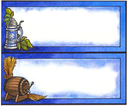
I offer for your consideration two versions of a decorative price tag set for beer. The first pair I did in real watercolor and ink, on real paper, a job of at least two hours if not more. But when I showed it to Mr. Art Director, he said immediately that he didn't like the blue color. He had approved the pencil sketch, but this once again reminds me that you have to show your work to the art director at every stage for his approval, from pencil sketch to inks to final color. What would he like the color scheme to be? I asked. He didn't know, but just not blue. How about gold and brown, the colors of beer? OK, that might do, he mumbled. "I can do that," I said cheerily. I didn't tell him how. He doesn't like computer art, he wants a "hand done" look.
I took the beer label pair home, scanned it, and cranked up Photoshop. It takes so long for this program to go into action that I can do some dishes while it starts up. Then I invoked the alchemical spirits. With the "Hue" changing tool, I set the color to gold and changed the blue to gold and brown. Then with the "Texture Brush" (to simulate hand-painted watercolor) I went over it to liven up the gold and orangey-brown. I enhanced the brightness and contrast, and finally I punched up the yellow and red in "Color Balance." Long ago in my youth when color TV was a big deal, I used to love to play with the "color balance" controls on the set. This is better than any color TV, and I don't have to watch bad acting and polyester outfits on it.
Having done all this, I then printed it out a few times to adjust how it printed on paper. The whole change process took about a half an hour. Next time I am at work, I will show it to Mr. Art Director. He will know that I used a computer, but the original work is all by my own hands. Here are the two versions: blue original, and modified gold.
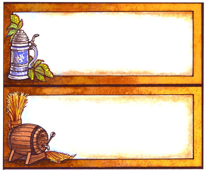
He still won't like it. But at least I'll have some beer.
Posted at 2:56 am | link