My weblog ELECTRON BLUE, which concentrated on science and mathematics, ran from 2004-2008. It is no longer being updated. My current blog, which is more art-related, is here.
Sun, 30 Sep, 2007
Self Portrait as a Pumpkin
I did this image for a fall promotion at Trader Joe's. My pumpkin face will be all over the store advertising specialty products. There will also be a giant pumpkin displayed in the store which weighs more than I do. Orangeness is for October! Yes, I AM THE PUMPKIN.
Markers on board, continued and finished in Photoshop.

Posted at 2:28 am | link
Sat, 29 Sep, 2007
Photoshop Phascination
My handful of Electron Readers may have wondered recently why I post less often here than I used to. I can sum up many of my reasons in just one word: Photoshop. It was only three months ago, in July, that I expressed my phrustration while learning this large unwieldy graphics program and trying to use it. As I said earlier, Photoshop is not the ideal graphics program for an artist. Most of the resources I have bought to help me use it are full of glitzy gimmicks which you can use to manipulate photographs and make modern-style advertising art. But that's not what I'm interested in. I want to make illustrations with it. I'd like to make architectural renderings too. There are resources for illustrators in Photoshop but most of the time I just play with it until I get what I want. Then I look at current graphics or comic art and see what other artists have done with it.
For instance, just take a look at this amazing public interior by digital artist Craig Mullins. I don't know what this scene depicts. It looks like a fantastic mall or enclosed forum in some alternate civilized world. I wish I had painted it. Note that it is not rendered in the super-realism of an architectural rendering, but in sketchy almost "impressionistic" strokes. This is what a master can do with Photoshop. I have a long way to go before I can create something like this. I used to do things like this in conventional media such as ink and watercolor, or acrylic, but I want to be able to do that digitally as well. It is even possible to create artworks, whether on Photoshop or Painter, that simulate conventional media so exactly that you cannot tell it is not a watercolor or an oil painting—at least on the computer screen. Much of the Photoshop instruction, though, is for people who do not have the artistic background and skills that I have. So when I sit down in front of the computer, I turn on Photoshop and spend hours sketching and experimenting. Other than the spacescape, I don't have anything to show you yet, but I will show it when I have something suitable.
I have limited time to work in my home studios due to my day job. Sometimes I have to do work for the day job at home, too. And I have lots of domestic tasks. So some things have had to be put on a less frequent schedule. I would welcome input from my Friendly Scientists on how I could continue doing calculus when I have so little time to work with. Right now I stare at my calculus book tiredly and have not changed the page or done problems in weeks. I certainly wouldn't be a good scientist or mathematician under these conditions. But I had to make a decision between something I do professionally and something I will never do professionally. Perhaps I will find another universe where time goes at another rate. As it was stated in TV Guide about some broadcast special, "Time may vary in your area."
Posted at 3:42 am | link
Thu, 27 Sep, 2007
Two Dark Ambient Albums
VAST
By Gregg Plummer
Privately released at www.greggplummermusic.com
VAST begins as a spacemusic album, rather melancholy in mood with a touch of "Gothic" added by ambient vocalist "Tunnel Singer" in track 2, "Blessing." True to classic space-ambient form, Plummer's music consists of slow smooth chord changes, layered with long synthesizer notes and lots of reverb. He works in both major and minor conventional keys, without too much reliance on the overworked modal/pentatonic sound of Euro-American ambient. For instance, Track 3, "Sunspots," is in a quiet and "sunny" major key.
But by Track 4, "Spatial Curve," Plummer's album starts turning into something a bit darker and more ominous. Track 5, "They Await," drops you right out of luminous space into a horrific world of ancient, inhuman intelligences from some black frozen abyss. He uses an effective combination of a deep dark repeating four-note figure topped with knife-thin metallic atonal notes. The next track, "Angel of Forgiveness," moves in a slow funereal orbit, while the piece after that, track 7 "Outside the Womb of Reality," places the listener in a nearly toneless, chilling world of technological drones, while in the distance what might be a persistent alarm bell warns of some unseen emergency. But the composer is merciful, and in the last track, "Embracing Infinity," he returns the listener to the world of rationality and hope, as his slow-moving, icy sound-clouds part to reveal the sunlight of a major chord.
Gregg Plummer's VAST, while remaining within the "tradition" of synthesizer ambient, conveys plenty of emotion and could easily be the soundtrack to a science fiction or space film. The music is purposeful and despite its slowness, it is concentrated enough to encourage imagination and visualization rather than putting you to sleep. Forces of both light and darkness can co-exist in this "Vast" universe.
PRIMORDIAL LANDS ARISE
By "SourceCodeX" (John Patterson)
Privately released at John Patterson's SourceCodeX site.
If Gregg Plummer's VAST encompasses both darkness and light, there is no doubt where "SourceCodeX" John Patterson is coming from. Just a minute or so of PRIMORDIAL LANDS ARISE will make it obvious that John Patterson is a fan of H.P. Lovecraft as well as other horror-fantasy world-spinners. With track titles like "DroneMass," "HellDream Vimana," and "VainTraditionsAbyss," Patterson wants to accentuate the darkness and bury the light alive. This is an album which depends more on textures and unholy evocations than on tonality or melody. Listening to this album you will encounter scaly hissing, distant monster fog horns, alien digestive glurp, hideously distorted voices, buzzing cybernetic insect noises, and deep fuzzy drones, and this is only in the first three tracks.
As the album goes on, Patterson zooms in on you with what sounds like old warplanes, and then plunges the listener into a suffocating hot night filled with toneless industrial drones, looping sonic horrors, and finally an oncoming giant throbbing entity announced by the crash of gongs and a muffled howling. The last track, "AlphaOmegaAdInfinitum," does not offer tonal relief or rays of returning light, but it is at least empty of looming threats, in fact is just empty which might be a relief in itself.
I don't want to see the movie that this would be the soundtrack for. Composer Patterson, who might love that kind of movie, fortunately has a wry sense of humor which offsets the scariness of it all. The graphic packaging for this album, all of it designed by Patterson himself, offers helpful advice such as "We are not responsible for blown speakers or shattered objects," and "Do not drive on long trips or operate heavy machinery while listening to this CD." I would also add, "May experience nightmares while or after listening to this album."
Posted at 11:12 pm | link
Thu, 20 Sep, 2007
The Gilded Age at Starbucks
The season's changing, and that means not only pumpkins and falling leaves, but another set of coffee board artworks at Starbucks. I currently serve five different Starbuckses, and possibly another one if I can contact the manager, who is a longtime friend of mine. Each season I think up a new theme for the boards. This summer's theme was Victorian houses and porches. For fall, I'm continuing the theme but depicting the interiors of those houses, in all their fringed and ornate glory.
I know a couple in the local area who are so enamored of Victorian design that they have decorated their own historic house in 1890s style. There are actually interior design resources that cater to such nostalgic re-constructionists. It's not cheap to outfit your home in the grand old style, but it is possible. But what if you aren't able to create your fin-de-siecle dream home?
Starbucks Coffee shops seem mired in nineties design, by which I don't mean the 1890s but the 1990s. It's interesting how the interior and graphic design of only ten or fifteen years ago looks stale while the designs of forty years past are used in clever revivals. Back in the days of the Victorian era, coffee shops were bigger versions of the upper-class private parlor, a place of elegance and leisure for ladies and gentlemen, as well as artists and writers. Just as nowadays, in the nineteenth century you might find a poet or playwright working out his verses while sitting at a table in one of these coffee houses.
It's in the spirit of the Nineties (eighteen-nineties, that is) that I create my "Gilded Age" theme signs for Starbucks this fall. I use images from period photographs of interiors, as well as a catalog for homewares dating from that era. Fringed tablecloths, grand draped curtains, beaded lampshades and hanging lanterns, coffered ceilings and wood paneling, potted palms and porcelain coffee services, make a bland brown Starbucks into a coffee house of old. Or at least you are there in the Gilded Age when you look at the illustrated coffee board.
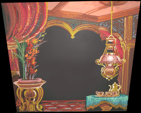
"Starbucks Gilded Age," September 07. Opaque acrylic markers on coated metal board. The blank space in the center is for the writing, advertising the featured "coffee of the week."
Posted at 3:48 am | link
Thu, 13 Sep, 2007
Beer, blue and gold
The mighty Photoshop has won me over. It can do marvels that would have taken a commercial artist hours and hours to do. Its digital alchemy can change lead to gold, at least in pixels. And when your art director complains that something is the wrong color, you don't have to go back to the drawing board to do it over, you just scan it in and spend an hour or so at the digital wizard's screen, and you've got your changes made.
I offer for your consideration two versions of a decorative price tag set for beer. The first pair I did in real watercolor and ink, on real paper, a job of at least two hours if not more. But when I showed it to Mr. Art Director, he said immediately that he didn't like the blue color. He had approved the pencil sketch, but this once again reminds me that you have to show your work to the art director at every stage for his approval, from pencil sketch to inks to final color. What would he like the color scheme to be? I asked. He didn't know, but just not blue. How about gold and brown, the colors of beer? OK, that might do, he mumbled. "I can do that," I said cheerily. I didn't tell him how. He doesn't like computer art, he wants a "hand done" look.
I took the beer label pair home, scanned it, and cranked up Photoshop. It takes so long for this program to go into action that I can do some dishes while it starts up. Then I invoked the alchemical spirits. With the "Hue" changing tool, I set the color to gold and changed the blue to gold and brown. Then with the "Texture Brush" (to simulate hand-painted watercolor) I went over it to liven up the gold and orangey-brown. I enhanced the brightness and contrast, and finally I punched up the yellow and red in "Color Balance." Long ago in my youth when color TV was a big deal, I used to love to play with the "color balance" controls on the set. This is better than any color TV, and I don't have to watch bad acting and polyester outfits on it.
Having done all this, I then printed it out a few times to adjust how it printed on paper. The whole change process took about a half an hour. Next time I am at work, I will show it to Mr. Art Director. He will know that I used a computer, but the original work is all by my own hands. Here are the two versions: blue original, and modified gold.
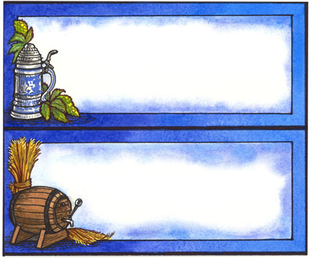
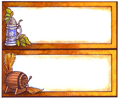
He still won't like it. But at least I'll have some beer.
Posted at 2:56 am | link
Thu, 06 Sep, 2007
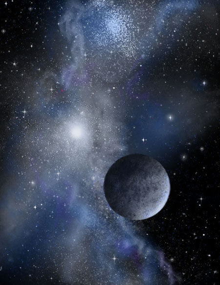
Astronomical Photoshop
In my ongoing program to master Photoshop as an artistic medium, I assigned myself an "astronomical," the trade term for a space picture. "Astronomicals" depict anything that's out there in the big wide universe, usually involving space, stars, planets, moons, comets, and so forth.
I used to produce lots of small space pictures, using acrylic on illustration board. I sprayed them with an airbrush and added details with a spatter brush and by hand. If I had time, I would add a planet, moon, asteroid or a spaceship. I made these pictures in "editions" of up to twenty at a time, all of them small jobs of about 10 inches by 7 inches. And I could sell them in bulk, too. One time many years ago I sent an edition of about 7 to a show in California and the same collector bought them all. Some of my editions ran to twenty pieces, and I sold every one of them at one convention or another. They didn't cost much, but they also didn't take much time to produce; usually just one or two hours, depending on whether I put a planet in it which I had to hand-paint.
This same painting process can be duplicated exactly in the digital image program of Photoshop. I "spray" airbrush color on a black background, adding "spatter" spots with another computer-generated "brush." Then I add in a planet and model it by hand, using other "texture" effects and applying them with a digital drawing tablet. One of the advantages of using Photoshop (or other programs such as Painter) is that you can add the planet or the spaceship or whatever on another "layer," an overlay which can be kept different from the background. You can choose to work on this overlay by itself without doing any changes to the background. You couldn't do this in acrylic unless you painted your planet on a clear sheet of acetate and overlaid it mechanically. This was done in the past for commercial work.
You might think that computer art especially for these small astronomical scenes would take less time than painting it by hand. After all, it's mechanical and should be labor-saving and quick, right? Well, it turned out that making my space scene in Photoshop took just as much time as painting it in real acrylic, that is, if I wanted it to look good. That means about two hours. The advantage of Photoshop is that it's easily changeable and it takes up no physical space. But the advantage of real acrylic is that you have a single and unique piece which a collector can buy and frame. Unless you follow some harsh gallery rules where you have to destroy the original file after printing just one copy of a digital piece, a Photoshop artwork can never be better than a print.
Here's my first complete astronomical scene done with Photoshop. By the way, it occurs to me that this Electron Blog is becoming more of an art blog and less of a math and science blog. I hope you don't mind. There's plenty of both to go around.
Space scene with chilly moon; Photoshop, original size 11" x 8.5".
Posted at 3:43 am | link
Mon, 03 Sep, 2007
My Art Shown in Iran
As many of you know, I have been associated with Zoroastrians and Iranians in general for some time. I studied Persian and Zoroastrian mythology and theology for many years, and wrote several published articles on Zoroastrianism. I am even trying to learn the Farsi language, from Persian friends and customers at my workplace and through language teaching books.
Zoroastrianism is the first monotheistic religion, proclaimed by the prophet Zarathushtra in ancient Iran perhaps about 1200 BCE. It is still practiced by a small number (perhaps 200,000) people around the world, especially in India and Iran. Through its millennia of history, this religion has adapted motifs and myths from many different sources. The gods of ancient Persia were re-envisioned as subordinate figures, somewhat like angels or good spirits, who did the will of the One God, Ahura Mazda, whose name means "Lord of Wisdom."
One of the theological features of Zoroastrianism is the embodiment of virtues and the divine presence in the material world, in a set of seven abstract personifications. These are known as the Amesha Spentas, or "Bounteous Immortals." These and other holy figures are not worshiped, but are venerated in the faith as connections between the world and God. Historically, they have not been shown as images, as Zoroastrianism has not been a very visual religion. But there is no prohibition on religious images as there is in Judaism and Islam. Between 1996 and 2000, I portrayed the seven Immortals as abstract but iconic figures, using influences from Modernist art, Deco, Byzantine, and ancient Persian art. I gave each one a theme, a color of the traditional rainbow, and a title. They can be viewed here, at my main webpage.
About a year ago, an Iranian Zoroastrian friend of mine asked whether I would like to show these images in Iran. He had access to art galleries and a community of art-loving people in both Tehran and in Yazd, which is one of the few Iranian cities with a large remaining Zoroastrian population. As it would be currently dangerous for me to go personally to Iran, or to send the original art there, I sent my friend a CD with high-resolution scans of the pictures, which would be made into prints to exhibit there.
Every cultural event in Iran must be inspected and passed by the Islamic authorities. In order to have the art show at all, the mullahs must allow it. They did not allow it in Tehran, but said it would be fine to show the Seven Immortals in Yazd, which was more remote and also more Zoroastrian. So my friend planned the show for a gallery in Yazd, to be held this March around the time of the Persian New Year, "NoRuz."
Paradoxically, though the Islamic authorities allowed the show, (Persian nationalism was also a factor) the Zoroastrian priests didn't like it at all and protested. They did not like the idea of images of anything in their religion and culture. Zoroastrianism, they claimed, was a purely abstract and image-free religion. This sounded more like Islam than Zoroastrianism to my friends (and to me). During my work on the Immortals, I was able to show one or two of them to an influential Parsi Zoroastrian Indian high priest at a scholarly conference. He said that there was no prohibition against images in the religion as long as they were not worshipped like idols. In fact, images of Zarathushtra are common, especially in Indian Parsi Zoroastrianism.
My friend decided to go against the resistance of the Iranian Zoroastrian priests and he printed and showed the prints in the gallery. They were not for sale, but were viewed by many enthusiastic people both Zoroastrian and non-Z. I knew that the show existed, but did not hear from my friend until he returned from his months-long stay in his native land. I finally got an e-mail from him a couple of weeks ago saying that not only was the show well-received by the people, but that he would be dedicating a room in the Yazd gallery just to those pictures and to other Zoroastrian images. I have sent my art all over the world, but this is the first time that it has been seen in Iran. It's definitely an incentive for me to make more art on Persian Zoroastrian mythical themes.
Posted at 3:14 am | link