
My weblog ELECTRON BLUE, which concentrated on science and mathematics, ran from 2004-2008. This weblog, which is more art-oriented, is its successor. Please visit the archives of ELECTRON BLUE using the link to the right.
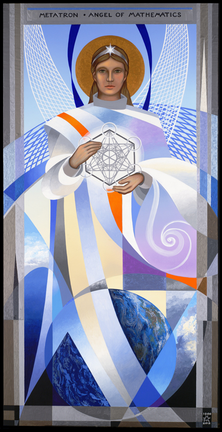
Metatron, Angel of Mathematics
It has been more than a year since I posted on this blog. During that year I have not been away from the studio, in fact I've produced a lot of art. But most of that art does not qualify for "Quality Art Product," in that it is either commercial or created purely for gallery sales.
Meanwhile, though, I was planning a major piece for which I received a commission (sponsorship) in 2011. The image you see in last year's last post, "Angel of Geometry," is the study for it. This major project is now done and presented to its client, so I can now show it. It is a "FuturIkon" in the same series as my Four Archangels of 1996 and my "Our Lady of the Cosmos" from 2002.
Metatron is an angelic being from the Kabbalistic tradition, though the name is probably of Greek origin, not Hebrew. Metatron is the leader of all angels, possessing a rank higher than the numerous choirs and echelons of angels and personified concepts. He/she is privileged to stand at the "right hand of God" and lead human beings towards the good. Metatron is not a warrior angel like Michael. Rather, he is thought of as the celestial scribe.
In my futuristic interpretation of Metatron, he/she is not only a scribe or a protector, but the keeper and personification of the most fundamental of sciences, Mathematics. Without mathematics, the world would not exist. Even modern mathematicians and philosophers sometimes say that mathematics existed before the world came to be, an ancient and angelic notion. Therefore I designed the image of Metatron to be built of mathematical symbols and shapes. The Angel's body and environment is made of forms such as conic sections (parabola, hyperbola, circle, and ellipse), and trigonometric fundamentals such as a right angle and a 30-60-90 degree triangle as well as an equilateral triangle. There are also exponential curves, straight lines, twisted graphs of relativistic space forming the "wings" of the angel, and a Fibonacci spiral. The Angel holds in her/his hands a diagram from the Kabbalistic tradition called the "Cube of Metatron," which encompasses in its intersecting lines the basic solid-geometric forms such as cube, tetrahedron, octahedron, and pyramid. It is also a six-pointed Jewish star.
The Angel stands over a stylized Planet Earth, as well as atmospheric visionary fragments and the blackness of space. The border is composed of many colors of metallic and iridescent paint, reminiscent of many precious metals in a mosaic arrangement. This painting is acrylic on masonite board, 18" x 36", finished in late June 2012. It took more than eight months to paint. Now, finally, I can present it to you after all this time.
For a larger view, please click here:
"Metatron, Angel of Mathematics"
Posted at 12:53 am | link
The Angel of Geometry
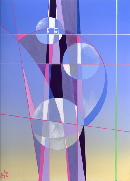
This is actually a sketch and a test run for a piece I've planned for later this year. The background, with its heavenly blend of sky blue and gold, is something I've had in my studio for years and years, and I'm glad I was finally able to use it. That gold-to-blue background is a solution to a painting problem in which I was faced with trying to put my colors on a white background. As it is, when I do the final version there will be a lot of airbrushing to do. After that, I'll paint my colors over this blended background, which will look much nicer, and I won't have to pile up the color in little heaps in order to make it cover and look evenly painted.
This picture is influenced by the work of Paul Klee and Rene Magritte. The top sphere looks vaguely like a head, in the whimsical style of Klee. I love these artists, Modernists and Surrealists.
"Angel of Geometry" is acrylic on illustration board, 9" x 12", May 2011.
Posted at 12:55 am | link
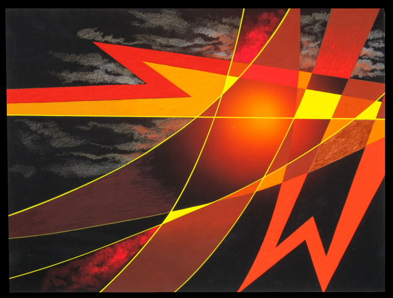
Torch of Defiance

Finally, some new art for "Art Product." "Wyatt's Torch," my new painting, is now done. It was originally conceived as an abstract meditation on an incident from Ayn Rand's ATLAS SHRUGGED, but underwent a re-conception when I decided to enter it in a local juried show at Falls Church Arts. The theme of this juried show is "Letters," in which you have to somehow incorporate one or more letters from our alphabet into your artistic entry. In this piece, I've placed the letter W prominently in fiery red on a black background. W stands for "Wyatt." I hope my art is accepted for the show.
In Rand's book, Ellis Wyatt is a defiant oil magnate who blows up his own oilfields and refinery rather than allow them to be taken over by the government. What is left after the destruction is one flaming oil derrick that no one could put out. That came to be known as "Wyatt's Torch." I am a big fan of fiery stuff so I am glad to create a picture full of stylized flames, volcanic and industrial-apocalyptic at the same time.
"Wyatt's Torch" is acrylic and colored pencil on illustration board, 16" x 12", March 2011.
You can view a larger version of "Wyatt's Torch" here.
Posted at 1:54 am | link
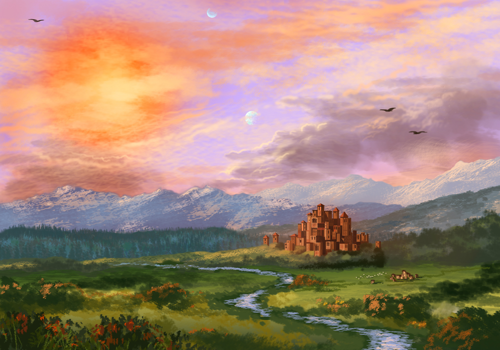
Darkover Idyll
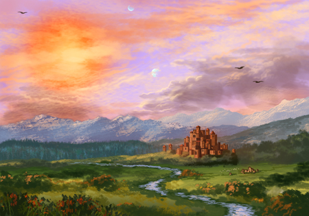
This is a fantasy picture and thus does not fit the criteria for "fine art," but I'm showing it here because it is a very nice picture and I'm getting better at working with digital painting. The title is "Darkover Idyll," and it is influenced by the American Luminist painters such as Thomas Cole and Frederic Church. Cole did allegorical paintings which would be considered fantasy nowadays, because they depict knights and castles in a romantic setting. This one of mine is more "fantasy" than Cole, though, because the sun is red and there are two moons. I have always found it interesting that Thomas Cole's moralizing, romantic allegories were considered High Art in the mid-nineteenth century but if they were painted now they would be relegated to the world of superficial entertainment art.
Darkover is the world made up by Marion Zimmer Bradley, in which fantasy and science fiction co-exist under a red sun. There is magic and psychic powers, but also an interstellar empire and space ships and colonists from Earth. There are alien races, some of them sentient, and there is medieval-style warfare fought with ancient weapons and psychic magic. There's something for everyone on Darkover. This is a scene of a peaceful place on Darkover, where the old castle has not been used for warfare in many years. It's my first "authentic official" matte painting. Matte paintings are big open scenes that can be used as background for close-up action in films or videogames. The shape of this image is not the wide panoramic rectangle used in matte paintings, but it could be cropped to fit that shape if necessary.
You can view a larger version of "Darkover Idyll" here.
Posted at 1:35 am | link
Bizmac
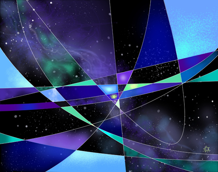
Here is "Bizmac," number 980D in my catalog, all done. I added plenty of color. If you don't like purple and green together, then this picture is not for you. But I was so sick of that standard primary blue and red that I use for my nebula and space pictures. This is all digital. No paint was spilled over this picture. And once I figured out how to use the "edge finder,", a tool which can fill in shapes made by intersecting lines, Photoshop went along quite quickly, though it gave my fidgety iMac (and me) the vapors a couple of times. There are plenty of printing options to bring this set of pixels into the world of paper and ink.
There is mathematics in this, too. There's a parabola or two and many wider curves. Also, the edge finder works by breaking a curve into smaller and smaller straighter segments, eventually becoming a set of points, just like in calculus. I haven't forgotten calculus!
The name "Bizmac" comes from a 1956 RCA computer. In those days, RCA still made computers, but stopped soon afterwards. These geometric designs were popular in the '50s and '60s. Things that were considered banal and tacky in decades past are now chic again. Digital chic, this time around.
"Bizmac" is done in Photoshop CS4, with Adobe Illustrator CS4 for the geometric linework. 14" x 11", or in pixels, 4200 x 3300, high resolution for printing. May 2010.
Posted at 3:08 am | link
Neutron Starlight
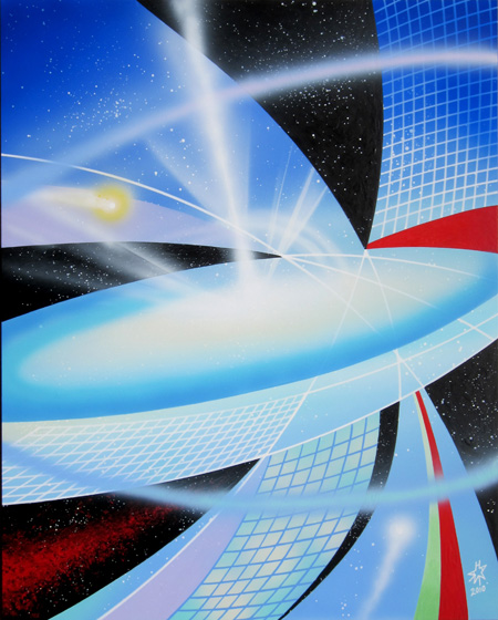
I haven't posted much recently to this Quality Art Product blog. This is because though I have done a lot of drawing and painting and digital art, none of it qualifies as quality art product. It might be fantasy art or science fiction or drawings of this or that, but it is not a serious effort. Nor do I post commercial work here. This blog is for fine art. In 2010 I finally put in the time and made a work of fine art.
This is a commission from a composer friend of mine. He chose four friends of his who were artists, and asked each one to come up with an artwork he would use as an inspiration for a piece of music. I am glad to be one of those friends. I am very interested to hear what he will create to go along with this picture. The multimedia concert is supposed to take place sometime this summer, with the paintings displayed where the music will be performed.
The title, Neutron Starlight, refers to the astronomical phenomenon that inspired this picture. Some big stars, when they run out of fuel, collapse into themselves and then explode in a huge blast, a supernova. What is left after the explosion is a superheavy core, spinning very fast and usually surrounded by a disc of glowing gases. This core also spins a jet of plasma off perpendicular to the disc. The core of the destroyed star is called a neutron star, because it is made of atoms so compressed by gravity that it is really a solid ball of neutrons, or degenerate matter. This extreme astronomical object is what I depict here. The twisted grids visible in the picture represent the distortion of spacetime created by the ultragravity of the star core.
The painting is acrylic on coated Masonite, 16 inches by 20 inches. It was painted mostly with an airbrush, a paint sprayer which is not usually used in fine arts. I paint my space pictures with airbrush because it delivers the textures that look most like space clouds and flames of plasma.
Posted at 2:37 am | link
Nebula Aurora
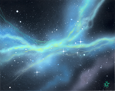
During November of this year I did a series of small space pictures, painted with airbrush and conventional brushes. I've been doing these for many years, but not much recently. My airbrush is still usable, though it's a bit dusty and corroded. It seems almost archaic to use airbrush and paint to do space pictures, when you can do the same thing even better using digital media like Photoshop. But even in this digital age, collectors still like an artwork done with physical media and by hand. This piece is one of my recent series. It's called "Space Aurora." It features one of my favorite colors, the ecstatic, hallucinatory light blue-green I call "Aurora Green." Auroras happen because of energetic particles from the sun striking gases in the Earth's upper atmosphere and causing them to glow. There are no auroras in space, but there are emission nebulas, which are sort of the same, made of gases that glow when energized by light from a nearby star. This is an image of an emission nebula. "Space Aurora" is acrylic and colored pencil on illustration board, 10" x 8".
Posted at 3:17 am | link
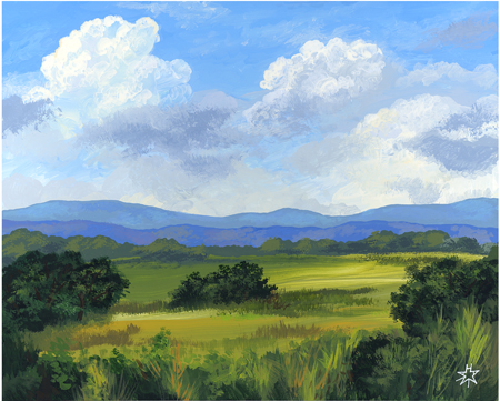
Summer Pastorale

My ambition for August of this year was to create art which would preserve the essence of summer for the whole year. Sometimes, for various reasons, I don't get to enjoy the real summer as much as I would like. I have always wished that I could create some way to return to summer in the middle of the winter. I've tried sun lamps, humidifiers, indoor gardens under lights, turning the heat way up, drinking hot drinks, most things except taking a trip to Australia, which is a bit beyond my means.
I can always paint something though, even something which is highly realistic. I worked on this piece throughout August and part of September. It's a real scene that I experienced and photographed in the Blue Ridge area of Virginia. I tried to capture the soft colors of landscape seen through warm humid air. I'd like to be able to walk into a picture I created and sit on a summer porch for a while, in December. Where's that Holodeck when you need it? At least I have this painting, "Summer Pastorale."
Well, I don't have it right now, because I have deposited the original with a dealer who will try to market it to expensive restaurants or fancy inns in the Blue Ridge area. I do not have to own the original artwork to get the summer effect, as long as I have a good photograph of it. Maybe I'll sell it to a tourist or Virginia resident who wants to capture summer as much as I do. You can see a bigger version of this image here.
"Summer Pastorale" is acrylic on board, 20" x 16", September 2009.
Posted at 2:09 am | link
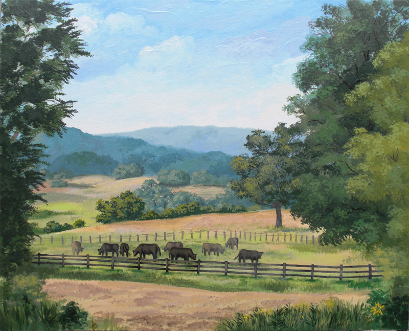
A Quiet Place in Virginia
Here is another version of the Blue Ridge scene I posted on August 8. This one is also acrylic on masonite, but slightly larger than the earlier one at 14" x 11". It's called "A Quiet Place." I hope to do a number of these Virginia country scenes, some with buildings and cattle and some without, and market them in upscale country and resort restaurants. Another possibility is small town tourist galleries, though there is a lot of this kind of art out there and I would have to choose carefully. I like painting these scenes because it is peaceful. I may keep a few of them for myself so that I can remember summer as it should be, not as it is for me in the city.
For the painters who might be reading this, here are some technical notes about this piece. I created a background under layer on pre-primed Masonite with colored gessos by Matisse Derivan, an excellent Australian supplier. These gessos are already in realistic landscape colors and the white can be tinted with whatever other color you need, in my case sky blue. I also added the lighter greens and golds for the field in this medium.
When the background colors were dry, I added in details of clouds with "regular" acrylic paint, from various different suppliers such as Matisse, Liquitex, and Winsor Newton Finity. After that was dry, I added in a flat layer for the mountains, again in the Matisse gesso. The idea is to get the basic color down in the colored gesso so that the area is covered, and then work over the dry background in semi-transparent acrylic. This solves a constant problem with acrylic, namely that most acrylic paints do not cover and have to be re-painted two or more times to get opacity.
The rest of the landscape was done in regular acrylic, using chrome green as the basic color and different versions of "Naples Yellow Hue" to vary the lightness. The darkest tree shadows were done by mixing black and dark blue (ultramarine) into the chrome green. Chrome green is a great landscape color because it is opaque. It is one of the few acrylic colors where you get results on the first coating. This is the color that the French landscapist Camille Corot used to create his ideal-real images. Unfortunately, back in the 19th century, chrome green was not a stable color and it oxidised to greyish black. I don't pretend to compare myself to Corot or even imitate him, but at least my modern chrome green won't fade. I finished the picture by adding in the fence with more opaque gesso acrylic and mellowing the color with a transparent acrylic burnt umber glaze. Lots more to follow in this series, I hope.
Posted at 9:29 pm | link
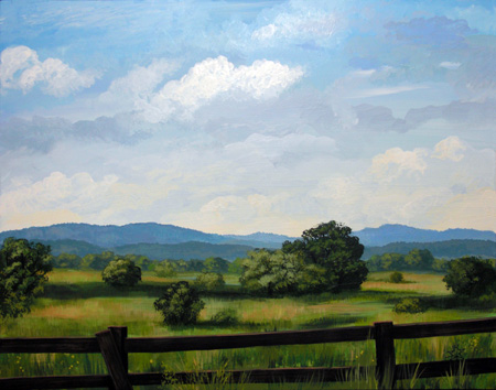
Blue Ridge Vista
I just finished the first of my new set of Virginia countryside paintings. This month I plan to do a series of them based on my travels in the Shenandoah valley. This piece is acrylic on Masonite, 10" x 8". It is small because it is a test of my color matching and sky painting strategies. The others will be larger. I want to convey a feeling of summer serenity with these images.
When I exhibit them, I need an "artist's statement." This is what I composed as explanatory text for this series:
"I think of the Virginia countryside as a landscape in perfect proportion. There are the distant hills in the blue of atmospheric perspective, then the closer hills in dark green, and then the radiant green of fields and vegetation closer to the viewer. I also love the endlessly changing light, color shades, and forms of clouds, in fair or stormy weather. This landscape is beautiful in all four seasons. I also like to include traditional architecture in my country scenes, because I love the geometry and textures of farm buildings. In these paintings and sketches, I try to convey the colors and feeling of a moment in time. In nature, the scene will change in the next minute but by the power of art, it will be captured, saved, and preserved in the viewer's memory."
Posted at 8:29 pm | link
![]()
Archives
July 2012 (1)
June 2011 (1)
March 2011 (1)
November 2010 (1)
July 2010 (1)
March 2010 (1)
December 2009 (1)
October 2009 (1)
August 2009 (2)
May 2009 (2)
April 2009 (1)
February 2009 (1)
January 2009 (1)
December 2008 (1)
Art
Art Renewal Center
Ryan Church
Syd Mead
conceptart.org
Craig Mullins
Laurent Beauvallet
Justin Sweet
John Wallin Liberto
Donato Giancola
Sparth
Stephen Martiniere
Lorin Wood
Henning Ludvigsen
Don Seegmiller
James Gurney
Andreas Rocha
Laurent Beauvallet
Joshua Middleton
Todd Lockwood
Hamzah Kasom
Petar Meseldzija
Raphael Lacoste
Quent Cordair Fine Art
Architecture and Design
BLDG BLOG
NOTCOT
DWELL
Daily Dose of Architecture
The Mid-Century Modernist
DEZEEN Magazine
Materialicious
Paleo-Future
Interesting Stuff
Shorpy historical photographs
Arts & Letters Daily
Neatorama